#mobile
#application
#figma

Decision
We discussed with the project managers, then they provided comments & suggestions such as the prototype would be integrated to other existing financial apps, including e-wallet (in this case we chose the big four; Dana, Gopay, LinkAja & Ovo) so it could be our expected Unique Selling Point. We considered and agreed that was the most suitable recommendation due to our timeline and MVP e.a: a mobile app that can manage & conduct financial records and integrate to other existing financial apps.
Next, on the other meeting discussion. We discussed the name for this project and went through a voting session, Cuanku was chosen over five other name options eventually. Then, we started to create a simple branding & logo.
Ideation
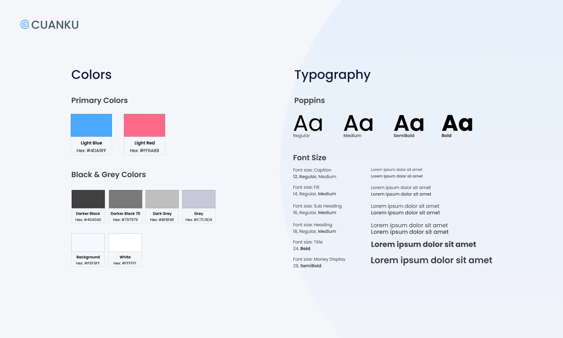
Before we continued to start working on the prototype, we set up the style guide for a simple logo, guideline and interface design. We use Blue as the dominant color which represents the financial application itself; trust, security & responsibility. Then we picked a lighter shade which gave us the persona of our participants due to the research.

-
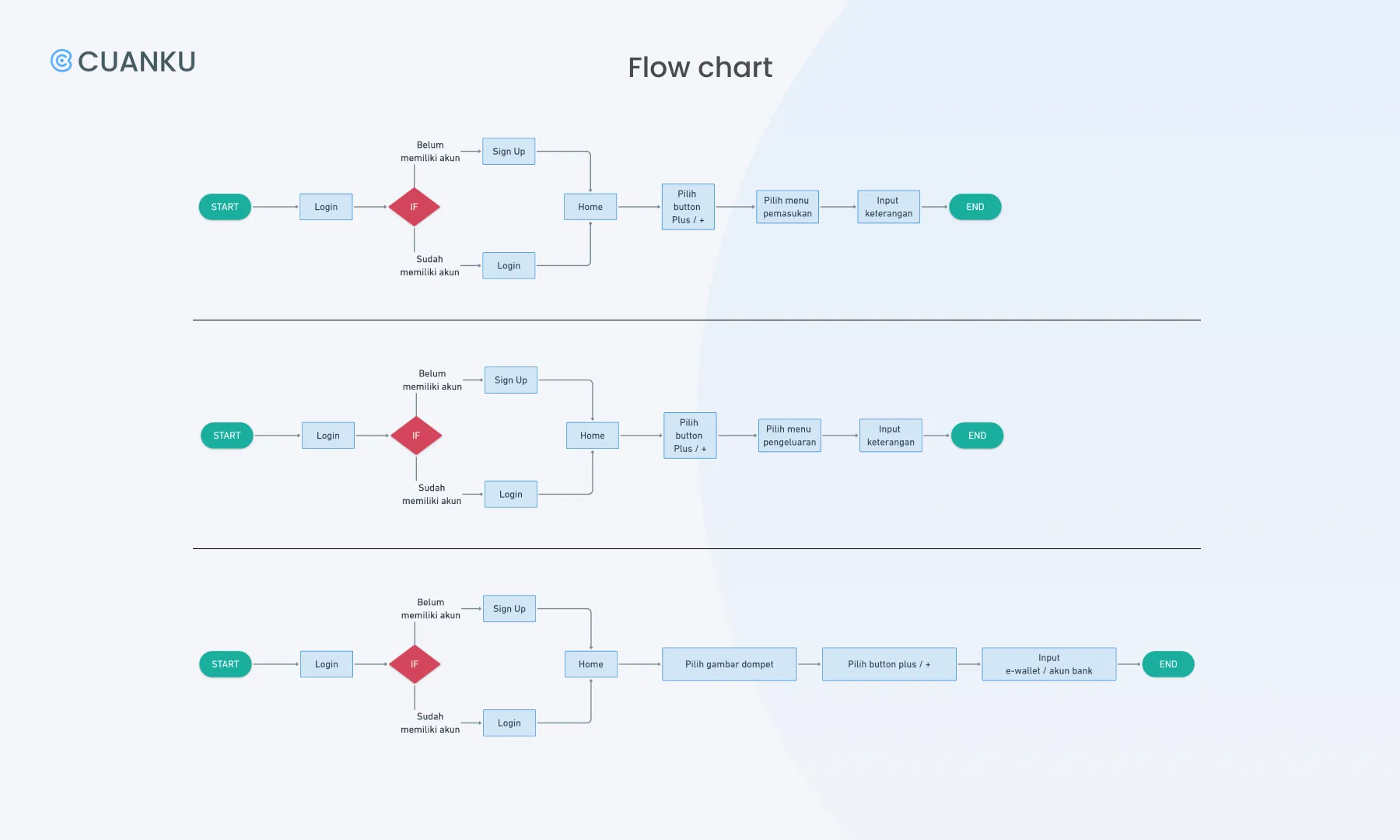
Once we selected the most suitable recommendation due to our MVP, we began to make a user flow chart in whimsical. By doing this, we were able to go through a lot of design ideas and quickly find the right ones. In this step, we just focus on the main feature flow of Cuanku which is adding the transaction so Cuanku can track users’ incomes or expenses.
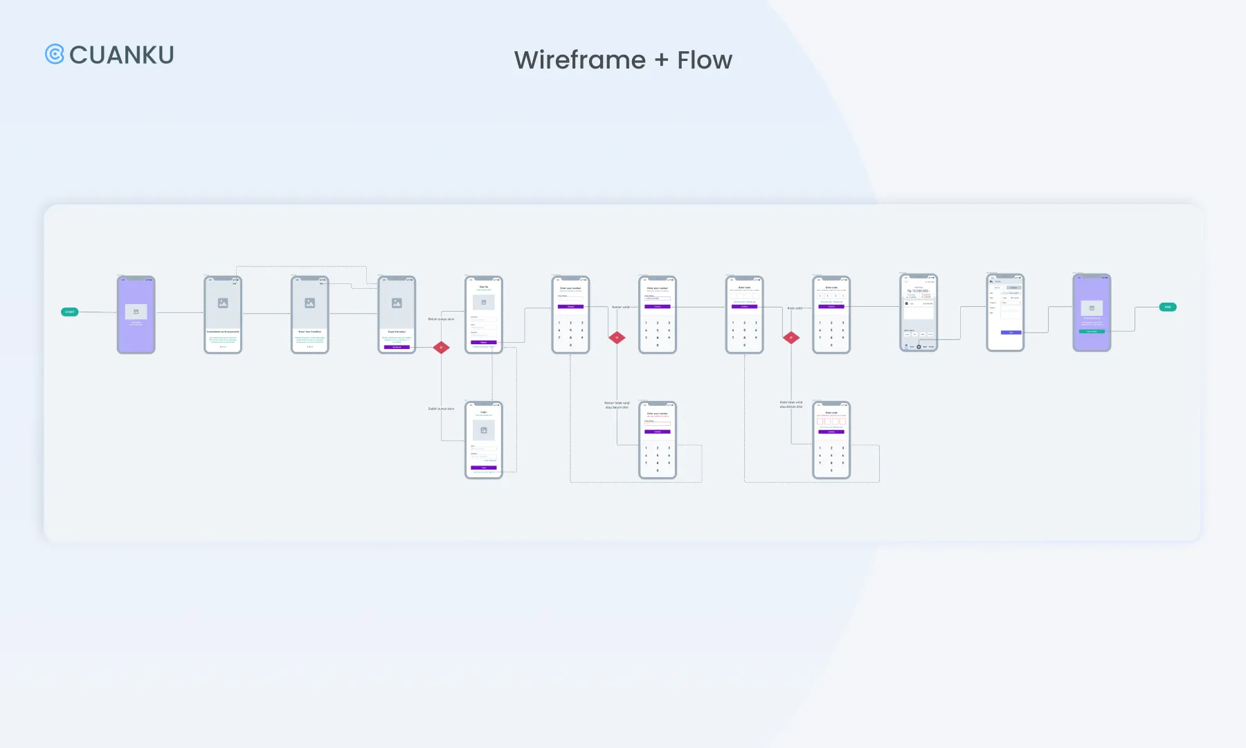
Low-Fi Prototype
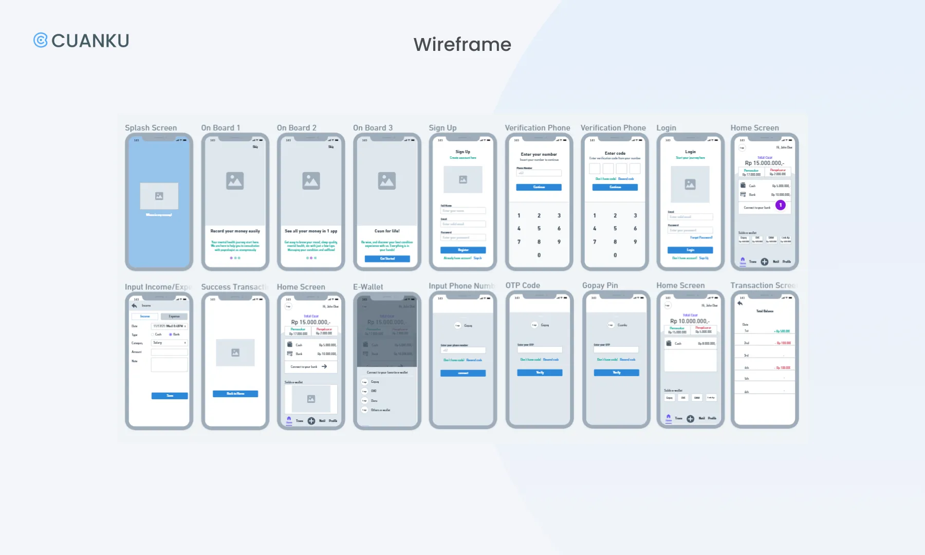
The prototyping process starts with a wireframe, we were using whimsical to design the digital prototype. Followed by giving flow to the wireframe according to the development of the previous flow chart. We decided to use Google Pixel 2 screen size (411x731 px) because most smartphone users in Indonesia use android. This visual guides us to figure out about the interface, but we focused on the functionality rather than the looks.
Hi-Fi Prototype
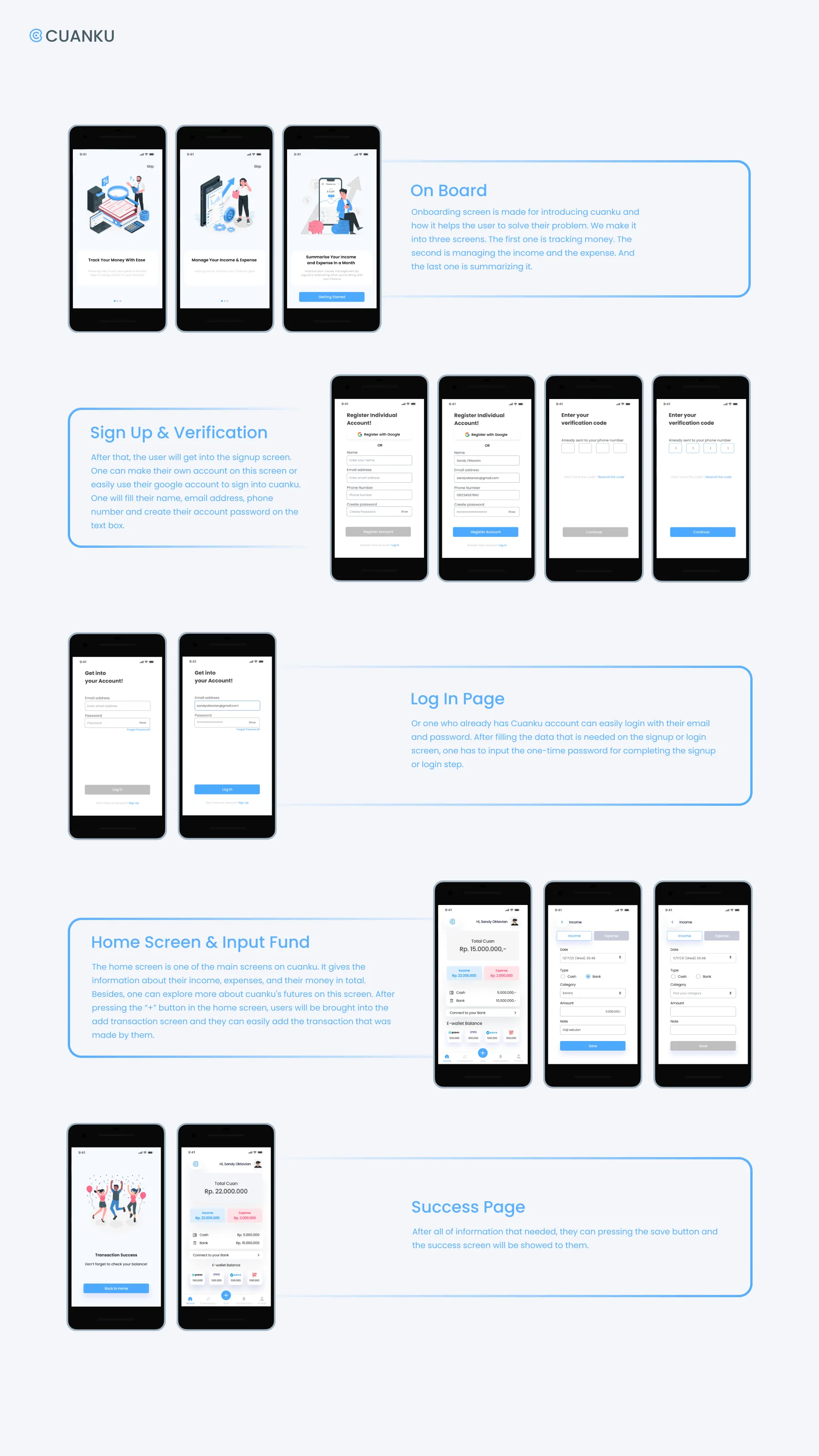
After creating the wireframe and flow we continued our step to a high fidelity prototype by using Figma Design. In our study case, we went through 2 sprints and iterations before finding the final design. So, it will be explained in this section.
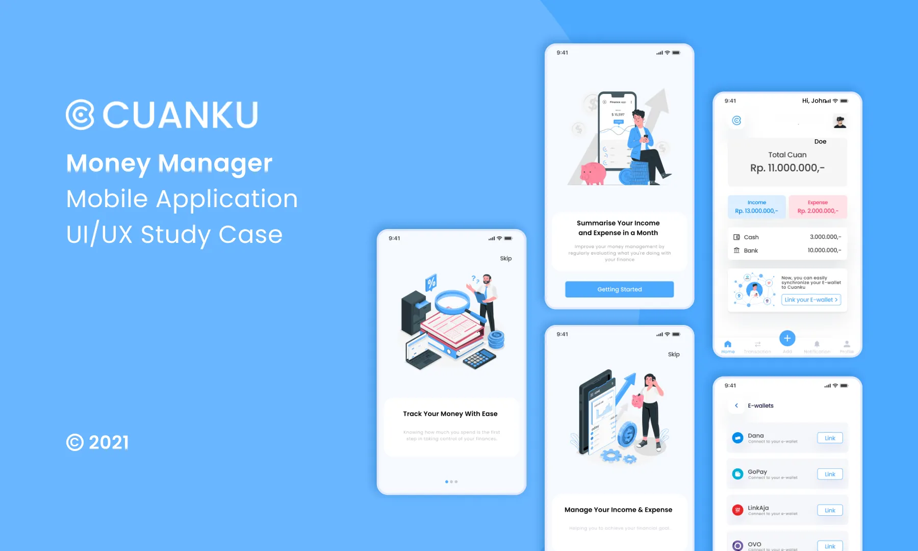
User Interface
According to the style guide and user persona, we created the user interface design. We chose to make it simple as it can be and hopefully can solve the problem of our research participants.

Sprint 1 — Usability Testing, Findings & Iteration
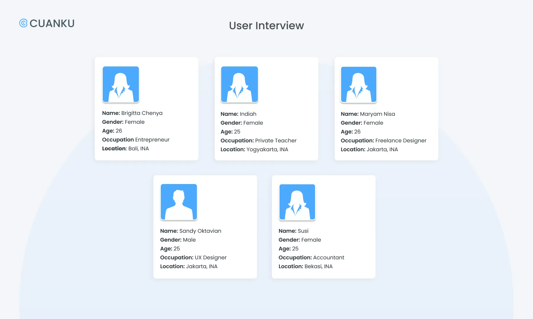
Once we finished the prototype, we continued to conduct usability testing interviews with 5 participants to get feedbacks and research results. From 5, we found 3 findings that have the same pattern.
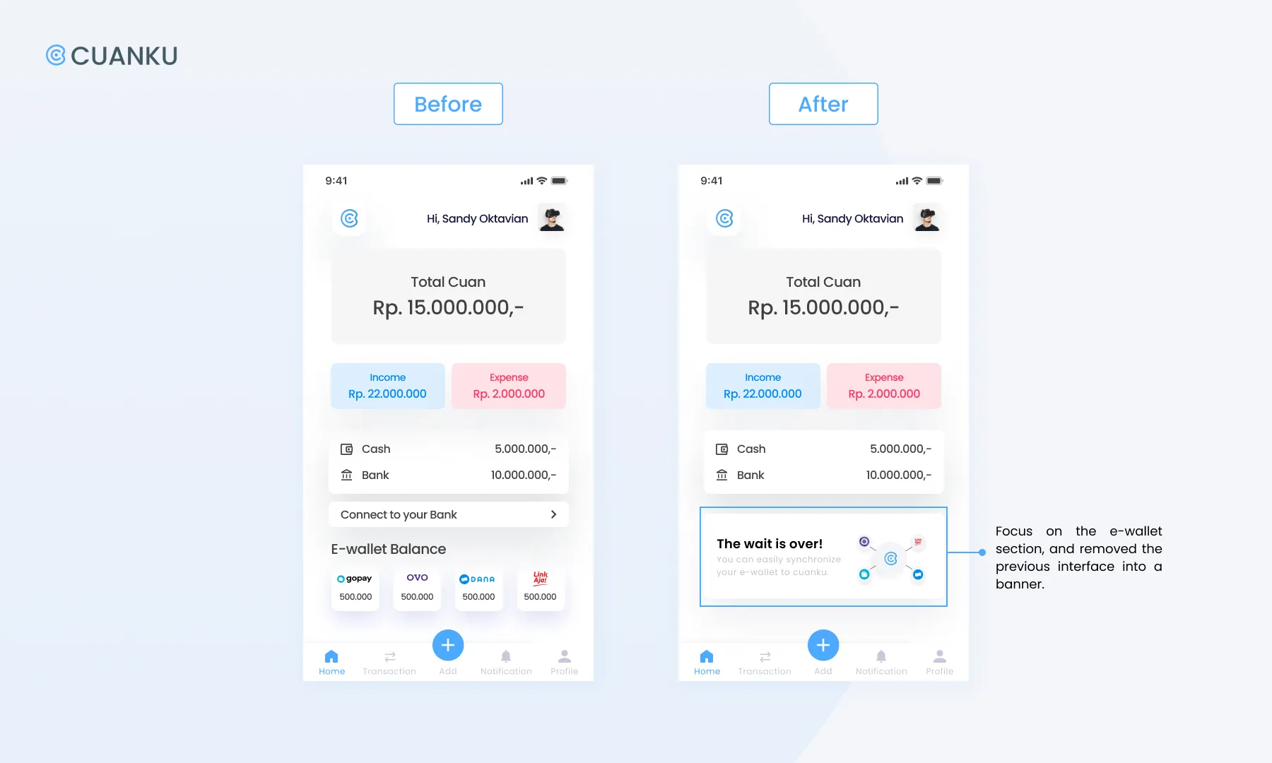
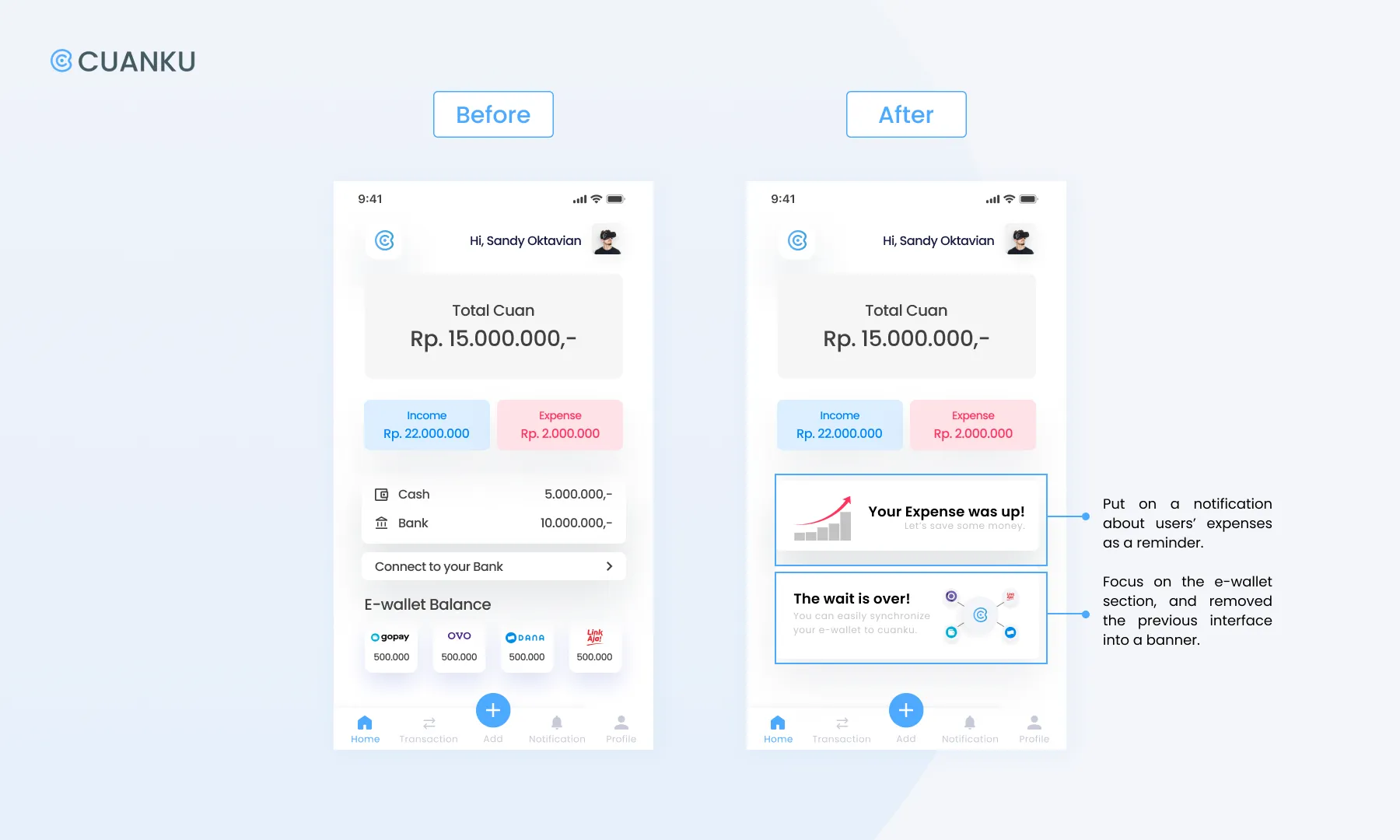
Finding #1: Most of the participants were confused by the appearance of the e-wallet logos on the home screen. The unique thing was that they thought they could do e-wallet transactions in Cuanku prototype.
Recommendation: We focus on the e-wallet section, and remove the previous into a banner.
-
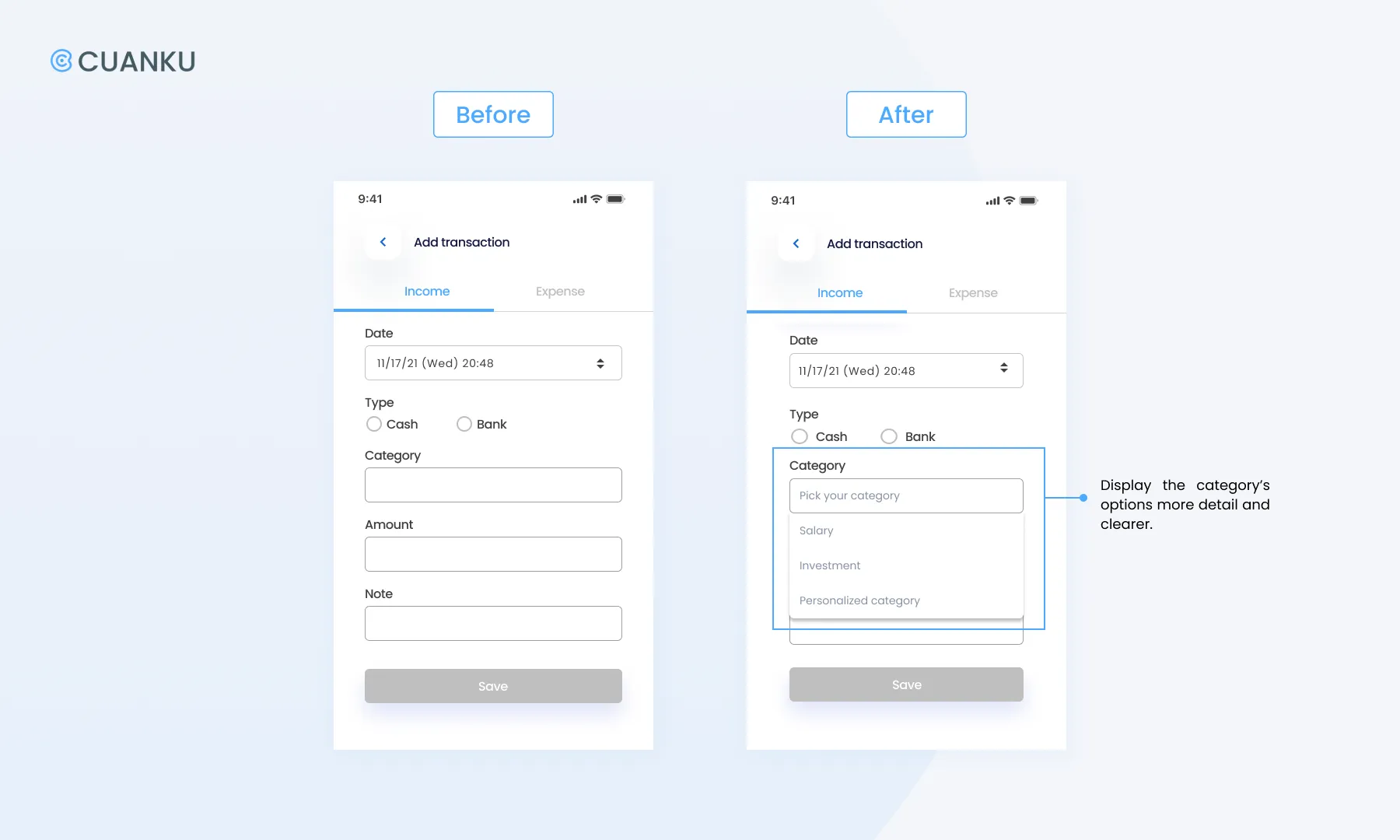
Finding #2: Some participants felt they needed more time to explore the “input fund page” to process or might create their own categories of income or expenses.
Recommendation: Provide dropdown menus for categories where users can fill in the name of the category they want, later they can classify it according to their own preferences.
-
Finding #3: There were participants who feel that they need to be given a daily reminder/a reminder because they are almost/already over budget.
Recommendation: Provide notifications that can help users to remind them about their expenses.
Iteration-Decision
After several discussions with our facilitators due to our MVP and schedule, we decided to develop the recommendation from finding 1 by focusing on recording money with e-wallets and connecting them with Cuanku so we could achieve the MVP (and USP). So, we added these two iterations:
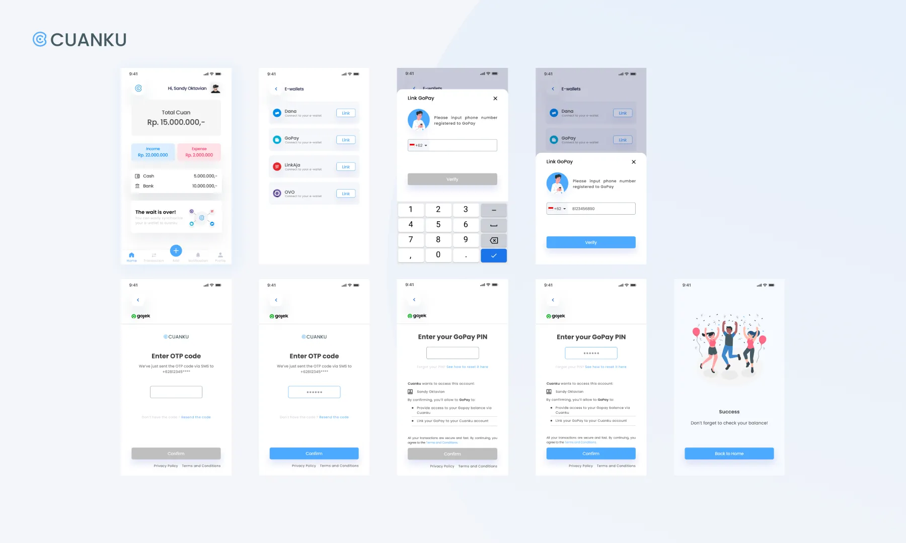
— Synchronizing Screen
For more advanced features we decided to offer the synchronizing option. So, User can easily synchronize their favorite e-wallet to Cuanku. So they can track their e-wallet transaction in Cuanku.

-
— E-wallet Balance Screen
After synchronizing the e-wallet, users can check their historical e-wallet transactions in Cuanku.

Sprint 2 — Usability Testing, Finding & Iteration
In approximately 2 weeks we conducted the second sprint to revise the selected recommendations from the first sprint’s usability testing. Once again, we conducted another usability testing interview with 5 participants to get new research results and found a finding who had the same pattern.
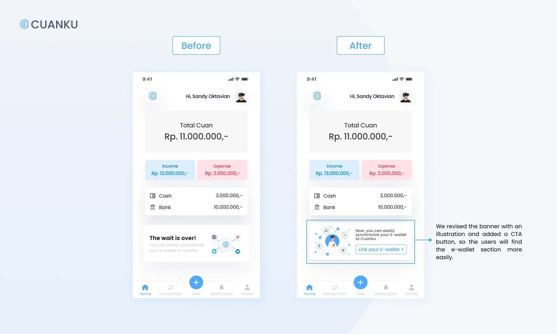
Finding: Most of the participants found it difficult to find a CTA to link the e-wallet with Cuanku (according to the scenario: Gopay). The participants took more seconds to process and find out about the e-wallet on the Home Screen.
Recommendation: Revise the banner which contains information to help the user connect Cuanku’s prototype with the e-wallet they use by adding a more user-friendly/understandable CTA button.
Latest Iteration:
You can visit and try our latest prototype by clicking this maze.

Conclusion
Working on Cuanku was so challenging yet interesting for us since we had to be creative and critical at the same time. Due to this study case, we learned the design thinking process by applying it. In a short period of time, this project made us learn to decide the most effective solution to solve the problem that we researched. Then, without having good coordination in time management, communication and teamwork, this project couldn’t be finished in time.
In this study case we also learned to understand about users & target market, processing feedback and finally we were able to make it into a prototype. With this opportunity, we could develop ideas and innovations from various perspectives (including business & technologies) related to Cuanku. We know that it is just the beginning. Cuanku can still be improved and developed by us.
Special thanks to our facilitators Sandy Oktavian & Gurun Nevada for helping us in completing this project.
References
The Asian Banker: Indonesia e-wallet transaction to reach $18.5 billion in 2021 amid fierce competition
Kumparan: Pengaruh Cashless Society dalam Kehidupan Sehari-hari
Statista.com: Market share of mobile operating systems in Indonesia from January 2012 to July 2021, by operating system
Figma
Trello

